Cadmium Yellow

Claude-Oscar Monet, Water-Lilies, after 1916

ARC EN CIEL
VOL. VIII.
CADMIUM YELLOW

Many artists are familiar with the name Cadmium. Cadmium yellows and reds have long been standard required paint colors for beginner to advanced painters. Cadmium yellow expresses color like no other. Besides its use as an artists pigment in oils, acrylics and watercolors, it has made regular appearances in toys, soap, glass, plastics and perhaps most famously, the New York Taxi, since production began in 1840. Why are these colors so popular, and furthermore, why are they so expensive as opposed to other hues of yellow and red? The truth is, to most painters, any other yellow just will not do. There is no other yellow with as much opacity, tinting strength, permanence and brilliance. Cadmium yellow is reliable and intense, two things painters find irreplaceable.
 
The relative cost of any paint always depends on how difficult it is to source, create, or process the pigment within the tube. Cadmium is an earth mineral that must be mined, processed and fused extensively before adding into a binder to make that extraordinarily luminous yellow paint. It is also pretty rare in the Earth's crust, with less than one-fifth of a gram of the metal (one fifth-ish of the metal in a thumbtack) in every ton of crustal material. (Source 1)

HAPPY ACCIDENTS
THE DISCOVERY OF CADMIUM

The source of cadmium yellow pigment is cadmium sulfide. In its pure form, cadmium is a silvery white bluish color. In 1817, German scientist Friedrich Stromeyer discovered a new metallic element, called cadmium, on accident when heating zinc in his laboratory. Typically, zinc remains white when heated, but while conducting routine tests, he observed a sample of zinc carbonate that formed a bright yellow oxide rather than white. Stromeyer suggested it was suitable for artist pigments, however it wasn't until the 1840s that the color began being produced industrially.

In the early years of production, cadmium sulfide was prepared with an acid solution of cadmium salt (either chloride or sulfate) which was heated with hydrogen sulfide gas until a powder was formed. Hues ranging from a very light lemon yellow to a deep orange were made in this way. A range of colors from very light yellow to deep orange and red can be made from the same mineral through variation of processing and particle size. The particle sizes of the deeper cadmiums are about fifty times larger than the paler varieties.
 
The deeper varieties of cadmium yellow and orange are the most permanent. Paler varieties are known to fade on exposure to bright or extreme sunlight. Cadmium pigments are classified as absolutely permanent for interior applications, but are not suitable for the exterior applications or for mural painting techniques as they are vulnerable to light & oxygen. When exposed to light, water, and carbon dioxide, cadmium pigments will fade and change color and form cadmium carbonate, a white crystalline compound. Interior permanence of cadmium yellows are excellent.

Cadmium yellow paints are generally available in light, medium, and dark and each variety has a markedly different value, intensity, and relative warmth or coolness when compared to one another. Cadmium Yellow Dark and Cadmium Yellow Medium are warm. Cadmium Yellow Lemon, Cadmium Yellow Light, and Cadmium Yellow Primrose are relatively cool compared to the “dark” and “medium” varieties of paint. If a cadmium color is not labeled with “dark” or “light,” the paint in the tube can always be assumed to be “medium.”

Claude-Oscar Monet, Lavacourt under Snow, 1879

PERMANENT + POPULAR
WHEN CADMIUM YELLOW BECAME THE MOST BRILLIANT

Cadmium colors have been popular with artists since first used as a paint pigment because they are permanent, bright, opaque, dense colors that mix well and predictably with other pigments.

During the Industrial Revolution artists began using colors never used or even seen before. The golden age of chemistry created pigments so new and bold, artists found them absolutely irresistible. Not only did these colors brighten the urban centers, but they widened painters’ access to color compared to the palettes of the Classical Era. Cadmium yellow was a revolution itself - the color was powerful and artists were quick to adopt it into their palettes. Pigment makers + grinders responded and pigment manufacturing became big business.

The birth of these pigment manufacturing during the nineteenth century meant pigments were no longer made specifically for artists’ use, but also for larger industrial coatings and printing industries. Manufacturers would put ready-made oil paints in newly developed collapsible tin tubes, much like the tubes we use today. The invention of the paint tube made these colors readily available + accessible and artists like Claude Monet, Mary Cassatt, Camille Pissaro, and later Cezanne and Matisse used them almost exclusively. (Source 2)

While these new colors were unfavorable to some, Monet and other 19th century artists found them striking. "Monet was so enamored of the new bright colors that he insisted on mixing even his dull tones from these strident pigments. In Monet's Lavacourt under Snow (pictured above) the subdued tones in the cottages, the trees and the pale yellowish sky are not rendered in ochres or earth pigments but are mixed from bright hues including cadmium yellow, cobalt blue, viridian, and vermilion. With viridian, emerald green, synthetic ultramarine, red lake and lead white, these make up the entirety of the palette." (Source 2) The pale lemon colored areas of the sunlit hill are cadmium yellow mixed with lead white. (Source 3)

"The Impressionists shaped the early work of many of the most important painters of the modern age. Van Gogh's work was transformed when he came to Paris and saw their paintings. They gave him the inspiration to use bold, unmixed new colors with glaring brilliance, such as those in The Night Café, 1888." (Source 2)

MODERN PIGMENTS
CADMIUM YELLOW ALTERNATIVES

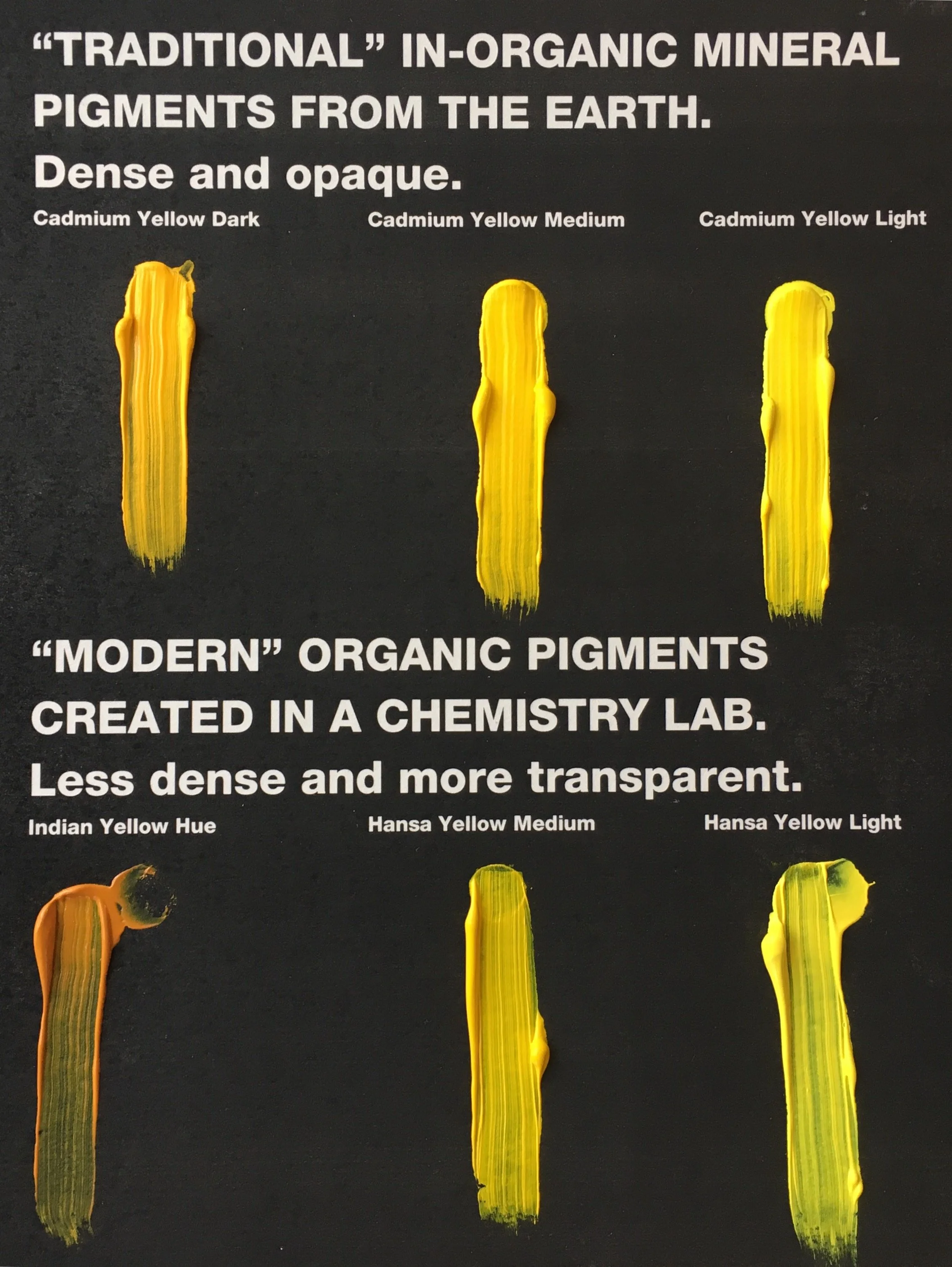
Artists concerned about studio safety or price of cadmium colors should explore chemically derived yellow pigments such as Hansa Yellow, Azo Yellow, or Indian Yellow. Regular Arc en Ciel readers may remember that, in general, mineral colors are more opaque than their chemically created, more transparent counterparts. None of the chemically derived yellow pigments are as dense or opaque as cadmium yellows, but for some painting applications that may not matter or be preferable. Opacity vs. transparency, intensity of color desired, and ease of application should all be considered before choosing the proper yellow for your studio practice.  
 
Hansa yellow is generally available in “medium” and “light” varieties which would be relatively warm and cool just as the cadmium yellows. They appear very similar to Cadmium colors but are perhaps 30% as opaque as cadmium colors. Hansa Yellow Opaque is available in some paint lines, but is rare as most artists choose Hansa because it is transparent. When looking for a hansa try Gamblin's Hansa Yellow or Williamsburg's Permanent Yellow, they both are made with the pigment Arylide Yellow, which is permanent and lightfast enough for use as the paint of choice for yellow traffic stripes on city streets.

Indian Yellow is a very warm orange-ish yellow that, in thick layers, appears similar to cadmium yellow dark. Although, Indian Yellow is very transparent and ten times more intense when mixed with white as cadmium yellow dark. Because the three substitute chemically derived yellows noted above are all more transparent than the cadmiums, those preferring the opacity of cadmium colors may find it necessary to paint an area with titanium white before covering with a chemical produced yellow. 

Liquitex is coming out with a non-cadmium line of paints set to be released in July 2017. They have created the first non-cadmium acrylic paint with the same performance, vibrancy, and lightfastness as cadmium paint, with the only caveat being that it is safer for you. With the introduction of the non-cadmium line, they are getting rid of their line of cadmium hues. As you know, we are able to order almost any art material, so if you want to give these new non-cadmiums a whirl, just holler at us.

STAY SAFE IN THE STUDIO
CADMIUM TOXICITY

Recently cadmium has come into question throughout the EU and a lot of misinformation about the toxicity of cadmium colors used in a controlled studio environment exists. On average, people consume about 30 micrograms of cadmium daily through a normal diet, absorbing 1 to 3 micrograms. There is currently no evidence that these trace levels pose a hazard to healthy adults. Humans can be harmed by a single large exposure to cadmium, and by long-term exposure to higher-than-usual concentrations. In agriculture, crops can absorb cadmium from the soil, creating unsafe percentages of metals in food. Some plants such as willow trees and poplars have been found to clean both lead and cadmium from soil. (Source 6) Most of the cadmium used today is for nickel-cadmium batteries.

Any artist using cadmium paints in a responsible manner need not worry about any adverse reaction to the metal as the pigments are practically insoluble. For instance, Gamblin Artist’s Oil cadmium colors are completely non-toxic when used as intended, due to their low solubility. Their cadmium pigments are manufactured in a blast furnace, making them permanently fused with inorganic sulfide, zinc sulfide or sulfo-selenide to render them insoluble in water (and therefore, our bodies). This is why many cadmium yellows, oranges, reds and chartreuse do not require health warning labels for skin contact or ingestion. There is no cadmium dust or “fumes” that come off paints in the tube, on your palette, or in your painting. Cadmiums do present a health concern if they are inhaled. We recommend you use a NIOSH dust respirator if you sand surfaces made with a high percentage of Cadmium colors or work with cadmiums in dry pigment form.

What does it mean to use paint responsibly? There is no need to work with gloves when oil painting with cadmium or cobalt colors. If you get oil color on your hands, simply wash them with soap and water. Wash your hands thoroughly before smoking, eating or drinking after painting. Do not place food or beverages near your palette or work table. DO NOT finger paint with artist-grade pigments. Still looking for more information on studio safety? Gamblin has an in-depth page dedicated to painting safely, including tips and tricks for storing rags + how to dispose of your paint tubes. Check out more safety tips here. (Source 5)

LESS CADMIUM FOR YOU PSA
DID YA KNOW?

Cigarette smoking seems to be more dangerous than painting with cadmium colors in a studio environment. Smoking is a leading source of cadmium exposure. Each cigarette contains roughly 1 to 2 micrograms of cadmium, and smokers absorb an additional 1 to 3 micrograms of cadmium into their systems daily for every pack they smoke. Studies have shown that smoking more than 20 cigarettes daily can increase cadmium levels in the body tenfold. Yikes! Yet another good reason to kick that habit. (Source 1)


Reference List

  1. The Facts on Cadmium, http://www.dartmouth.edu/~toxmetal/toxic-metals/more-metals/cadmium-faq.html
  2. Philip Ball, The making of Cézanne’s palette, Published in Helix magazine, X(2), 2001, http://www.philipball.co.uk/articles/colour/52-the-making-of-cezanne-s-palette
  3. http://colourlex.com/project/monet-lavacourt-under-snow/
  4. http://www.webexhibits.org/pigments/indiv/history/cdyellow.html
  5. https://www.gamblincolors.com/studio-safety/studio-safety-create-without-compromise/
  6. https://en.wikipedia.org/wiki/Cadmium

Tyrian Purple

ARC EN CIEL
VOL. VII.
TYRIAN PURPLE

For millennia Tyrian Purple dye was one of the most prized products of the Mediterranean coastline. Symbolic of both the heavens and the very best of the material world, the people loved purple with an absolute passion.

Exuding wealth, sexuality, power, lust and fervor, purple made a statement like no other color. Purple is the color of royalty, as well as the highest vestments in priesthood and the mad desire for purple power + lux looks led the color to be one of the most legislated in history, to the extent that during some emperor's reigns (as such the case with Nero + a few ruthless 5th century Christian emperors), if you were caught in a purple dyed garment , you would surely face execution. The desire for purple was truly a deadly fashion phenomenon. (Source 1)

Tyrian Purple as a paint pigment was used as early as the 17th century BCE in the Aegean. One of the earliest examples we have that utilizes Tyrian Purple as a paint is in the fresco Saffron Gatherers (pictured below), from the Aegean Island of Santorini, ancient Thera, during the Late Bronze Age. It wasn't until half a millennia later that the Phoenicians created a splendid recipe using purple pigment as a dye for wool, cotton and silk that Tyrian purple, steeped in mythology, legend, history and mucous, became the worlds most luxurious color.

SAILS, SNAILS + SOFAS
THE INVENTION OF THE COLOR PURPLE

"Purple the sails, and so perfumèd, that
The winds were lovesick with them"

William Shakespeare, Antony and Cleopatra (II.2.192-206)

Muricidae, a large and varied taxonomic family of small to large predatory sea snails commonly known as murex snails or rock snails, has at least three varieties of dye making snails. Trunculus, brandaris, haemastoma, all make a purple-ish dye either on the side of red or blue, but only trunculus produces the rich purpura, a blue-purple indigo dye that we know as Tyrian Purple. The Phoenicians were the first people of the Mediterranean to extract it in the Lavant around 11th century BCE. (Source 2)

So how does a sea snail become purple dye? First, you have to dive and collect the snails along the rocky coast of the Mediterranean Sea. Next, crack the shell to find and expose the murex's hypobranchial gland, then slice the gland to extract the mucous and finally with exposure to sunlight spontaneous pigment formation begins - the mucous from the gland turns from yellow to green to blue to a really beautiful purple. (Source 2) Watch it in action here. Yes, purple stank. Imagine being downwind the city of Tyre (where the Tyrian Purple namesake hails) in southern Lebanon today, where large stone vats of hundreds of thousands of sea-snails were soaking in a mordant (likely stale urine) and wood ash for the pleasure of purple.

There are no shortage of stories about Cleopratra as a scheming seductress and her lifetime of massive scandals. Purple at the center of both sexuality and power was played out at a famous dinner party in 49 B.C. Julius Caesar had just won battle against Pompey, and Cleopatra organized a feast described as "luxury made mad by empty ostentation." Cleopatra had a captivating presence and was well known for her intelligence, prowess, wit and ambition. It wasn't just Cleopatra's sails that were purple - her everything was purple - her palace was lined with purple porphyry stone & her sofas covered with vivid fabric "long steeped in Tyrian dye from more than a single cauldron" and she smelled of lavender scented perfume. Julius Caesar fell for it hard + went back to Rome wearing a totally purple, sea-snail-dyed, head to toe toga. An item and color only Caesar was allowed to wear. (Source 3)

Can you guess how many sweet sea-snails it takes to make a single toga purple enough for Cleopatra + Caesar to wear? 10,000 of them. 

Want to snag the pigment from 10,000 sea-snails for yourself? 4,280.00 USD will get it for you. But be kind to your wallet and those little sea creatures and consider some of the purple painting + mixing tips from Jules at the bottom of the email.

ATTENTION-COMMANDING AEROSOLS
MONTANA 94 GIVES POWERFUL MONIKERS TO THEIR STANDOUT PURPLE SPRAYS

Spray paint industry leader and our favorite matte rainbow-in-a-can Montana 94 (and it's glossier sibling - Montana Hardcore) gives other brands a run for their money in terms of creative color names. While Tyrian Purple is neither a pigment name - or even pseudonym - for any of our stocked products, we came across these luxe purple sprays with rather royal names:

SHIVA VIOLET (MTN 94) 
The Hindu triumvirate consists of three gods who are responsible for the creation, upkeep and destruction of the world. The first two are Brahma and Vishnu, while we'd like to call your attention to the third; Shiva.

Brahma is the creator of the universe while Vishnu is the preserver of it. Shiva's role? To destroy the universe. Don't panic though - this god does so in order to re-create it!

Hindus believe Shiva's powers of destruction and recreation are used even now to destroy the illusions and imperfections of this world, paving the way for beneficial change. According to Hindu belief, this destruction is not arbitrary, but constructive. Shiva is therefore seen as the source of both good and evil and is regarded as the one who combines many contradictory elements. (Source 3)

Contradictory to any image of destruction or doom, Montana's Shiva-inspired shade is quite the calm, uplifting lilac. Think of it as a balancing, beneficial complement to another fiery, contrasting color.

SULTAN VIOLET (MTN 94)
A noble title with a mini-encyclopedia worth of historic meanings, Sultan was originally an abstract Arabic noun for strength, authority, and rulership, derived from the verbal sulṭah, meaning authority or power.

Later, it came to be used as the title of certain rulers who claimed almost full sovereignty in practical terms (i.e., the lack of dependence on any higher ruler), albeit without claiming the overall caliphate, or to refer to a powerful governor of a province within the caliphate. (Source 4)

A rich, full-bodied and jewel-toned purple, Sultan Violet could absolutely stand alone as the authoritative purple among your personal Montana 94 palette.

PROPHET VIOLET (HARDCORE)
Prophets speak for God or a deity, or by divine inspiration. In Islam, the Prophet is Muhammad - the religion's founder. In Christian belief, Moses was the greatest of Old Testament prophets. Across a number of belief systems, a prophet is inspired teacher or leader.

The definition of Prophet, though, that most resonates with the Montana Hardcore Prophet Violet as we view it? One who foretells or predicts what is to come. Because this variation includes weather prophets, it lends itself to the high-contrast yet smoky, blue-gray purple shade called Prophet. It's like a lightning clap against an early sunset in a summer storm - that doomed and quickly darkening sky despite the daytime.

REVEREND VIOLET (MTN 94)
The Reverend is an honorific style most often placed before the names of Christian clergy and ministers. There are sometimes differences in the way the style is used in different countries and church traditions. The Reverend is correctly called a style but is often and in some dictionaries called a title, form of address or title of respect. The style is also sometimes used by leaders in non-Christian religions such as Judaism and Buddhism.

Sidenote because, well, we wanted to know too! Style vs. Title? A style comes before a title - a descriptive non-title if you will. It's the Royal in Royal Highness, the Honorable in Honorable Judge. Furthermore, from the Endless in Endless Knowledge-Base (aka Wikipedia):

"The term is an anglicisation of the Latin reverendus, the style originally used in Latin documents in medieval Europe. It is the gerundive or future passive participle of the verb revereri ("to respect; to revere"), meaning "[one who is] to be revered/must be respected". The Reverend is therefore equivalent to The Honourable or The Venerable.

It is paired with a modifier or noun for some offices in some religious traditions: Anglican archbishops and most Roman Catholic bishops are usually styled The Most Reverend (reverendissimus); other Anglican bishops and some Roman Catholic bishops are styled The Right Reverend; some Reformed churches have used The Reverend Mister as a style for their clergy."

Montana 94's Reverend Violet is a deep, highly opaque and incredibly resilient shade (it's got the highest UV resistance rating MTN94 offers!). 

THE REAL REV. VIOLET
POWER OF PURPLE

Speaking of resilience, did you know there is an actual "Reverend Violet"? Yep! A champion for the homeless, Reverend Violet Little hails from Philadelphia and her resilience helped those without homes defend their right to dine with dignity:

Reverend Violet founded the Welcome Church - a church which is technically homeless itself, as Welcome has no permanent headquarters. 

Relying mostly on word-of-mouth, Reverend Violet's services are often attended by a cross-section of the city’s homeless population. Some suffer mental illness or addiction, while others lost their jobs during times of economic duress. Many are wary of city agency help because of parole violations or immigration status. Some have homes but are disenchanted with typical church services. The Welcome Church even draws teenage volunteers from the suburbs. No questions are asked, and everyone is welcome.

Once a month in any kind of weather, hundreds of people gather for communion, song, and fellowship beneath a tree on a stretch of grass on the Benjamin Franklin Parkway.*

“The lines get blurred between who’s a volunteer and who isn’t,” Little says, recounting the time a homeless man offered her a sandwich. “In reality, we all have much more in common than we think.”

Little has spent years fostering connections between the city’s homeless and those who can help them, whether by networking to enlist volunteers, referring people to mental health services—or fighting legal battles. Her congregants' rights to gather on the Ben Franklin Parkway was challenged in 2012, when the city of Philly confusingly decided to ban the public sharing of food on the Parkway, a grand thoroughfare lined with institutions and symbols of art, faith and government. It’s also where an estimated 175 homeless people sleep every night.

Ever resilient, Reverend Violet banned together with a trio of motivated faith-based organizations and, with the help of the ACLU, they won a lawsuit and reversed the city's strange attempt to stifle food-sharing in what had become the Welcome Church's sacred space. The decision set a crucial judicial precedent nationwide; powered by Reverend Violet and Philly's cautionary tale, similar food-sharing bans in cities in Colorado, Texas and California have since been challenged. (Sources 4 & 5)

Inspired by Reverend Violet (and we don't just mean the Montana eggplant hue)? Volunteer for Food for Thought! One of Toledo's own hunger-fighting champions, the organization shares food every Saturday morning; lunches packed with the help of people throughout the downtown Toledo area. Individuals and groups accompany Food For Thought on (quite artfully detailed) mobile pantry routes to provide food, water or coffee, and encourage community and conversation with the people they meet along the way — sunshine or snowfall. And, never losing sight of our email's main theme, Food for Thought's logo and branding (and even their popular Jam City signature fundraiser) enthusiastically employs the use of purple! 

Love Food for Thought's vibrant violet? Get a similar shade in your own artwork by using either Raval Violet or Sultan Violet in the more matte Montana 94. Prefer a slicker sheen? The closest glossy grape is Montana Hardcore's Tube Violet. Not too confident with cans yet? Check out our Toledo class schedule - we've got a great spray paint techniques class in which you'll get to paint a galaxy (maybe in purple, eh?) slated for Saturday, June 10th!

*Traveling to Philly, art lovers? The Benjamin Franklin Parkway is touted as "America's most artistic mile", bookmarked on one end by the Philadelphia Museum of Art - the vast collections of which make it the third-largest art museum in the country. And for those of you who can't get enough of spray paint (and the mural arts for which Montana 94 is one of the world's most popular tools), check out Philly's unparalleled program. Philly Mural Arts engages in between 50 - 100 public art projects each and every year!  Rather go west? We hear there's quite the memorial celebration planned for The Purple One this weekend...

A ROYAL PAIN IN THE PAINT
TIPS FOR MIXING DIY TYRIAN PURPLE

No access to snails or science labs, and want to make the most of the primary paints you've already got rather than shelling out cash on a pre-mixed hue? Mixing purple from reds and blues seems like an easy task, right? Right? 

Actually, many attempts at mixing purples become murky and quite frankly, ugly. The good news? Your friendly Depo owner, Jules, has some helpful hints:

The answer lies in one word, “undertone.” Paints have what is called both a “mass tone” and an “undertone.” A mass tone is what it sounds like… what the paint looks like when piled in a thick mass on a palette or canvas. Undertone is what the paint looks like when spread very thinly across a surface. Some paints (mostly inorganic pigments, mined from the earth, used from the dawn of time through the industrial revolution) have the same mass tone and undertone. Newer, chemical paint pigments (concocted in a chemical lab with new advances in science after the industrial revolution through modern times) generally have a spectacularly different mass tone and undertone. The masstone or undertone of a paint generally shifts toward either a warm tone, or a cool tone. There are very few colors of paint manufactured that are truly neutral and neither warm nor cool. Artists desiring to mix beautiful purples should be aware of the tones of their reds and blues they are attempting to mix.

Cool blues (Pthalo Blue Green Shade) generally have green undertones. Warm reds (Cadmium Red Medium or Light) tend near orange. If you mix a cool blue with a warm red, you are essentially mixing green and orange, which will produce a muted brown. The brightest purple mix will come from mixing a warm blue (ultramarine) with a cool red (quinacridone red) because you won’t be co-mingling any unintended paint colors.  

Check this video from British artist Will Kemp on how to mix Purples. It sums up this discussion perfectly.

TO CONSIDER:
White is generally always added required when mixing purples. Artist quality paints are generally very pigment dense. The pigments are so close in proximity that they don’t allow much light to pass or refract through the paint, so adding white or transparent medium is required to lighten up the mix.  

Inexpensive student grade acrylics generally contain more than one pigment in a tube, as they combine a mix of inexpensive chemical pigments to replicate in mass tone a more expensive mineral (inorganic) pigment. The pigments in each tube are not “pure,” they are a mixture. Trying to mix two premixed, mixtures will always lead to unintended results. Hence the reason that many color-theory teachers and professors always tell students who are serious about painting to buy artist quality paints, as they only contain the pigments clearly labeled on the tube.

Reference List

  1. Victoria Finlay, Color: A Natural History of the Palette, 2002
  2. Setting the Archaeo-Chemical Record Straight Regarding Tyrian Purple Pigments and Dyes, Zvi C. Koren, of the Shenkar College of Engineering, Design, and ARt, https://www.youtube.com/watch?v=T3zxUEQBVv8
  3. BBC: Religions; Hinduism,  http://www.bbc.co.uk/religion/religions/hinduism/deities/shiva.shtml
  4. Sultan: Entry via Wikipedia, https://en.wikipedia.org/wiki/Sultan
  5. Information on Reverend Violet Little & the Philadelphia Food Sharing Case excerpted from both http://www.philly.com/philly/columnists/ronnie_polaneczky/20120614_For_minister__it_s_about_more_than_feeding_the_homeless.html and http://www.dailygood.org/story/1021/reverend-violet-little-encore-org/

Terre Verte

ARC EN CIEL
VOL. VI.
TERRE VERTE

When you walk into our shops, you might think we're selling plants over paints - especially in Bowling Green!

While we vow to remain your favorite art supply store first and foremost (and an aspiring greenhouse only in our spare time) we do love the way all those lil' green guys make our stores - and us - feel. The Depo Peopo are not the only ones inspired by everything green, as evidenced by Pantone's recent release of their Color of the Year...

Pantone describes Greenery (Color 15-0343) as symbolic of new beginnings, expanding on "a fresh and zesty yellow-green shade that evokes the first days of spring when nature’s greens revive, restore and renew. Illustrative of flourishing foliage and the lushness of the great outdoors, the fortifying attributes of Greenery signals consumers to take a deep breath, oxygenate and reinvigorate.

Greenery is nature’s neutral. The more submerged people are in modern life, the greater their innate craving to immerse themselves in the physical beauty and inherent unity of the natural world. This shift is reflected by the proliferation of all things expressive of Greenery in daily lives through urban planning, architecture, lifestyle and design choices globally. A constant on the periphery, Greenery is now being pulled to the forefront - it is an omnipresent hue around the world.

A life-affirming shade, Greenery is also emblematic of the pursuit of personal passions and vitality."

While Greenery doesn't exist as an exact, named shade or pigment, we've scoured our inventory to bring you some of our favorite greens; those that bring to mind secret gardens, spring peeking in, tree-canopied hikes, cherished houseplants, carefully curated conservatories, and grassy plains as far as the eye can see.

UNDER THE SKIN
GREEN IN UNDERPAINTING

Terre verte (or green earth) and related tones have been used as a painting base for ages. Terre verte had been noted as used a tad less frequently than the other earth pigments due to its relative scarcity. The earthy green pigment came from two clay minerals, celadonite and glauconite, which occur naturally all over the world. These have a complex silicate structure containing aluminium, iron, magnesium and potassium ions, which when mixed together in perfect harmony, produces a lovely dull green, ideal for underpainting European flesh. (Source 2)

Underpainting, or the initial layer of paint applied to a ground, serves as a base for all other colors to follow. Most often monochromatic, underpaintings guide the color values to later be used in a painting. While there are several types of underpainting, such as grisaille, veneda, verdaccio, and morellone, today we’re zeroing in on verdaccio.

Verdaccio is the Italian term given for a mixture of black, white, and yellow pigments that result in a soft, greenish brown color. Verdaccio’s most popular use is to bring light and life to European fleshtones. This method can be traced back to the early Renaissance, when the artists of Italy would combine Mars Black and Yellow Ochre to efficiently establish shadows in the fleshtones in their fresco paintings.which originates from the Italian fresco painters of the early Renaissance. One of the most well-known evidences of this method can be seen at the Sistine Chapel, where Michaelangelo left architectural features in pure Verdaccio, but painted over the soft, greenish-gray for skintones and other details.

If you've ever wondered why the faces in an old painting have a greenish cast, it may not have been intended by the artist, nor had it perhaps always been that way. It may be that the thin, pinky-orange skin tone layer applied over top has faded over time - a symptom of age or, sometimes, a more fugitive pigment having been chosen before time or technology could appraise the artist to what his or her work would look like entering the next century. If the underpainting is showing through, that painting just might need a conservator to the rescue! (Source 3)

EASY-ISH WAY OUT
TERRE VERTE, CHROMIUM OXIDE + MORE

Modern paint companies make underpainting a bit more of a breeze. Ready-mixed greens can easily balance out the pink tones in Caucasian skin, and rather than mixing black and an ochre try your own simpler Verdaccio techniques using Terra Verte or a mixture of Chromium Oxide Green and Mars Black. 

About these colors plus a few others...

TERRE VERTE
From Williamsburg, about their oil paint variation... "Green Earth is known by an assortment of names such as Stone Green, Verdetta, and Celadonite. Other names refer to the source of the native iron / magnesium colored clay, such as Bohemian, a high quality grade of pure green hue. It has been popular for centuries with many cultures. Native Americans also were fond of using Green Earth as a colorant. Since Medieval times it has been used as an underpainting color for flesh tones in portraits."

CHROMIUM OXIDE GREEN DARK
Golden fans loved their tried and true original Chromium Oxide Green so much that the company released a darker variation in early 2010. From the company upon it's release, "This new green is a darker and cooler version of the well known, very useful and long used green pigment. It fills a color space somewhere between Jenkins Green and Sap Green Hue, with very good opacity, and adds to a relatively small line up of inorganic greens. It is not quite as opaque as our standard Chromium Oxide Green, which is rated 1. It dries to a satin like finish."

FRENCH TERRE VERTE
"When comparing the French Terre Verte to the Italian Terre Verte, the first difference is that the Italian version is much more yellow and overall warmer. In locating a comparable color, French Terre Verte has an unexpected similarity to Cobalt Green. Its transparency, matte quality and subdued strength is a guarantee that this comparison only be made in hue. They both have similar pine tree color qualities. The transparency of Terre Verte in general is what makes this color so valuable in different palettes. It does lend itself to a landscape palette but more importantly, due to its transparent nature is very useful in imparting subtle tones to a portrait palette," notes Williamsburg. And... since the science nerd in all of us is just dying to know, we should share that they also explained the pigment as a "natural ferrous silicate containing magnesium and aluminum potassium silicates is a transparent bluish green that exhibits a slate like grit."

(Digging all these gritty details from Williamsburg and their parent company, Golden? While we didn't find a particular green to highlight in this bunch, if you love extensive color detail as much as we love Terre Verte you should check out this article on the company's other excellent earthtone selections!)

UNDERPENCILING?
TRANSITIONING PAINTING TECHNIQUES TO TODAY'S MEDIUMS

Green underpainting isn't limited merely to painters. Try utilizing Verdaccio techniques with colored pencil! One great example to check out next time you're in our shop is the cover art for the Strathmore 400 Series Colored Pencil pad. The original work was created by Brian Scott, a UK based artist who first tried oils and acrylics but didn’t feel successful with them. Eventually finding colored pencils as his niche, the artist like that pencils are much tidier and require less space.

Where does Verdaccio come in? Well, from Strathmore we learned, "Once he (Brian Scott) started to use colored pencil, he was challenged to make his pencil work look more like an oil painting rather than a traditional drawing..." Check out what appears to be an incredibly clear example of green (our newest not-a-word word) underpenciling - the skin and undereye area of the subject in Brian's work.

Get the look in your own work with Faber-Castell's Polychromos pencils. We recommend trying their Chromium Oxide Green, Permanent Green Olive, and Olive Green Yellowish shades and then choosing a favorite based on your own style and artwork subject.

OLIVE, YOU LOVE, WE ALL LOVE GREEN
CHECK OUT THESE PRODUCTS TOO! 

We love green across the medium lines. Here are some inks we're going gaga for...

Noodler's Army Green Ink: If you love reading about color - especially the history behind how and why any given art supply company chooses the colors and names that they do - you could spend a lil' time (like... a week-ish... or something...) sifting through all the fascinating details behind Noodler's inks. We love Army Green for it's yellowish green hue reminiscent of fatigues, but found a cool Toledo-based tidbit when doing our research... The company's GI Green color, part of their V-Mail (victory mail) series, was originally based on the color of Willy's Jeeps! Sorry to say it's now reformulated and less true to the historic accuracy of the “government issue green”, but it's Noodler's hope that this new color is easier to use in modern applications. Another reason? This ink has a huge British following, and the new color recipe produces a shade reminiscent of British racing green (though still in line with certain darker green jungle and hedgerow campaign uniforms). (Source 4)

FW Ink's Olive Green: Check out that lovely, quite opaque olive color of the FW Ink droplets above. This product is liquid acrylic and thus has excellent permanence ratings and adheres to many surfaces - paper, wood, ceramics, leather and more. You might even try a wash of it on your next canvas as an underpainting, eh?

PLANTS IN PASTEL
SOFT GREENS GO VIBRANT

Oooh ooh ooh, we just love plants in pastel. Don't you?

(Before we go on... can we just pause to check out how much pastel pops on this black velour paper, available in our BG shop? It's as fun as velvet Elvis, but less "All Shook Up" and more all succulents!)

Want to color in your own outdoor scene, but don't know where to start? Mary Jane Erard is the Depo's premiere pastel teacher, and much of her work centers on the lovely green stems popping out of the ground. Whether it's lush lavender fields or tempting tulips, much of what's green can be brought to life through pastel.

Typically Mary Jane keeps her teaching in the classroom, but this summer she'll take pastels to the park! The new Middlegrounds Metropark, which opened just last fall, is quickly becoming the go-to happy place for all of us downtown and now? The go-to art place too!

Located just a quick 15 minute walk from our St. Clair shop, Middlegrounds includes sparkling river frontage and 28 acres of greenspace including over a mile of walking and bike paths that meander along the Maumee. Sound like the perfect place to play with pastels? We thought so! 

So... why not sign up for Plein Air (in soft OR oil pastels) right down at Middlegrounds?

GO GREEN
PAINTING IN THE WILD

We love the use of greens of all kinds in the Toy Tableaux oil paintings by Aaron Pickens, on display now through April 30th in our BG shop.

Admiring his work and would love to paint with Aaron? Well, we've got another avenue to get y'all out into the big, green open! Take a Plein Air Painting class led by the artist in BG this summer. They'll be offered the second Friday in June, July, and August. You can sign up for just one at $50 each, or save $15 by committing to the full summer (3 classes) at $135. Details here, and stay tuned in the coming weeks for another email detailing even more fun outdoor workshop plans!

(Both the image above and below are original works by Aaron. Check out the dinos on top on display in our shop right now!)

PAINT PLANTS
KATI KLEIMOLA'S UPCOMING EXHIBIT + CLASSES

One exhibit comes down and another arises. Once Aaron's Toy Tableaux show is de-installed, we'll be introducing the fab florals by painter Kati Kleimola for the months of May & June in BG.

Along with her solo show, Kati will be teaching a handful of classes for us. The first of those listed is for little hands in particular! Kati will lead kiddos ages 7-12 through creating with color - green among it! The image above is our promo for Mixed Media Flowers class. During the two-hour class, students will create a beautiful floral painting with basic flower shapes, adding oil pastels, watercolor, acrylic paint and cut paper. All supplies are included in your student's registration.  

With limited space in this super fun course, we advise you sign your little artist up today! And stay tuned - Kati's painting class for adults will be listed super soon.

Check our sneak peek image for Kati's exhibit below. After that? Get outta your computer and wander off to explore that great, (slowly but surely becoming) green earth!

Reference List

  1. Image Source for Sistine Chapel: Dennis Jarvis via Flickr.
  2. A History of Pigment Use in Western Art Part 1, Originally titled "A Colour Chemist's History of Western Art", published in Review of Progress in Coloration, Millennium Issue, Vol. 29, 1999, pp 43-64, Society of Dyers and Colourists, Bradford, UK, http://www.pcimag.com/articles/86476-a-history-of-pigment-use-in-western-art-part-1
  3. Why Are Some Icons and Gothic Faces Green?, The Way of Beauty, David Clayton, Thomas More College of Liberal Arts, http://thewayofbeauty.org/2012/01/why-are-some-icons-and-gothic-faces-green/
  4. Source for Noodler’s Ink Info: http://noodlersink.com/whats-new/reformulated-gi-green/
  5. Image source for Middlegrounds Metropark: https://metroparkstoledo.com/explore-your-parks/middlegrounds