ARC EN CIEL
VOL. II.
MUSTARD
Mustard is intense, murky, neither crisp nor fresh, and not exactly pretty. It is yellow's less acidic, more earthy cousin. It looks stunning on redheads and hangs out on the shadowy side of gold. Mustard is one of Pantone's most fashionable fall colors that has been popping up everywhere; a retro hue bringing glam and bohemian vibes of the 1970s back to life. It is our love for this dark yellow, inspired by zesty hot dogs, fashion, tradition, the 15th century palette of Jan van Eyck, and of course the Ohio leaves turning from green to golden mustard to fiery-red, that we bring you our second volume of Arc en Ciel dedicated to mustard.
ROOTS OF OCHRE
THE SOURCE OF MUSTARD COLORED PIGMENT
In the lakelands of Italy there is a valley with ten thousand ancient rock carvings. These petroglyphs of Valle Camonica are signs that Neolithic people once lived there, telling stories and illustrating them with pictures. As Victoria Finlay (a Hong Kong-based author who writes about arts and travel) was there contemplating the past, she noticed an unusual small stone on the ground; she picked it up and realized something wonderful. On the front it was flat and on the back there were three planes like a slightly rounded three-sided pyramid. When she placed the thumb and the first two fingers of her right hand over those three small planes, it felt immensely comfortable to hold. And what she realized then was that this piece of clay was in fact ochre, and had come from a very ancient paintbox indeed. She wet the top of it with saliva, and once the mud had come off it was a dark yellow color. It was extraordinary to think that the last person who drew with it, whose fingers had formed the grooves, lived and died some five thousand years ago. He or she had probably thrown this piece away after it had become too small for painting. Perhaps a storm uncovered it, and left it for Victoria to find.
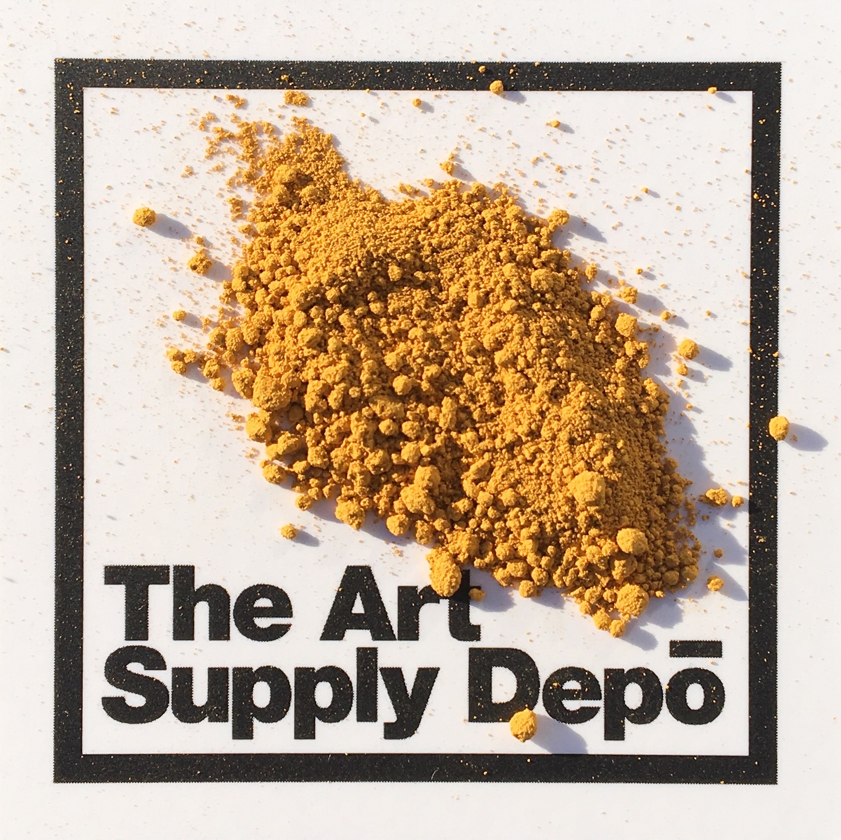
Ochre (iron oxide) was the first color paint. It has been used on every inhabited continent since painting began on cave walls, and it has been around ever since, on the palettes of almost every artist in history. The word "ochre" comes from the Greek meaning "pale yellow," but somewhere along the way the word shifted to suggest something more robust: something redder or browner or earthier. Now it can be used loosely to refer to almost any natural earthy pigment, although it most accurately describes earth that contains a measure of hematite, or iron ore.
There are big ochre mines in the Luberon in southern France and even more famous deposits in Siena in Tuscany. Victoria’s little stub of paint might have been brought from that area by Neolithic merchants, busily trading paint-stones for furs from the mountains. Cennino Cennini wrote of finding ochre in Tuscany. “And upon reaching a little valley, a very wild steep place, scraping the steep with a spade, I beheld seams of many kinds of color,” he wrote. He found yellow, red, blue, and white earth, “and these colors showed up in this earth just the way a wrinkle shows in the face of a man or a woman.”
In Australia, cave painters used this paint more than 40,000 years ago. In modern day Arnhemland, aborigines still use it as body paint and to decorate baskets, digeridoos, and sacred objects used in ceremonies. Stones of ochre are mined from the earth, wet with water or fats, and rubbed vigorously to be made into pigment. The stones have the right combination of clay and color to make painting easy. As the elder members of these aboriginal communities age and pass on, their ceremonial cultural life is becoming rare and beginning to fade away. Ochre has incredible links to early human art-making, but it is not a pigment strictly limited to the past. If you look at the paint tubes of Daniel Smith Watercolors, Golden Acrylics, and Williamsburg + Gamblin Oil Paints, you’ll see that yellow ochre pigment is really the only way to get those true, gorgeous, dusty, earthy yellows (Source 1).
SACRED OCHRE
TRADITION, MEDICINE + BURIAL PRACTICE
A substance that occurs naturally throughout the earth’s crust, yellow and red earths are iron oxides in various states of hydration. Cultures have used iron oxides for their medicinal properties, in ceremonies, as communication, and in art since prehistory and continue to use it today.
Ochre Pits are sacred sites that Indigenous peoples of Australia have been harvesting for use in ceremony, art and medicine for thousands of years. Men would save the fat from hunted kangaroo and emu to use with red ochre to coat boomerangs, spears, and other tools and weapons to preserve & protect them. Yellow ochre was traditionally used in ceremonies by women. Northern regions would use white ochre in times of grieving, most often young men would paint themselves with white ochre to express grief when mourning the loss of a wife (Source 2).
In Ancient Egypt The Pharaoh’s doctors used yellow ochre as a cure for skin wounds, internal maladies and as a preservative in mummification (Source 3). Aboriginal medicine used ochre mixed with cold ash as baby powder and like the Egyptians, typically used ochre-fat mixtures as poultices on wounds. Sometimes, a possum fur & red ochre mixture was dusted onto burns that had been dabbed with melted fat. Wounds from spears were treated by a mouth full of yellow ochre chewed and spat vigorously onto the site by the healer and covered with warm leaves, while healing songs were sung over the patient (Source 4).
Prehistory Central Asia used ochre during burial customs symbolically and functionally as ochre has anti inflammatory and antiseptic qualities. Cultures from 5000 BC - 3500 BC would line burial chambers with ochre, richly sprinkle bodies after death with it before burial, or clean the bones of the dead and cover them with ochre (Source 5).
WILLYBURG MUSTARDS
EVERY RUN OF THE MILL IS EXTRAORDINARY.
Some of the finest pigments can be found in Williamsburg oils. Each color is milled in small batches to bring out the best qualities of each individual pigment. And while the hunt for the perfect pigment is an intoxicating trip around the world, getting the proper pigment is just the beginning. So much of the quality of oil paint is in the grinding.
Williamsburg grinds each color to enhance the beauty and luminosity specific to that particular pigment. Each color has its own standard in order to develop the richest expression of color and undertone. This approach preserves the range of texture oil paints had in the past and categorizes the grind variations. Some colors will feel slightly gritty; others extremely smooth. Depending on the size of the pigment grind, that the same exact pigment can then reflect warm or cool tones when added to the paint binder, therefore creating two totally different hues from the same pigment. Williamsburg’s ochres are naturally hydrated iron oxide, the same stuff people have been digging up and grinding for 40,000 years to make paint. Their Italian Yellow Ochre is chunky and gritty to allow light to travel through the vehicle, exposing rich golden or brilliant mustardy undertones instead of just heavy, dull yellows.
RAW SIENNA
A beautiful, transparent, golden undertone, very luminous in washes and glazing. Relatively strong.
- CI Name: PY43
- Pigment Name: Natural Hydrated Iron Oxide
- Lightfastness: ASTM I - Excellent
- Series: 1
- Opacity: Semi-Opaque
- Grind: Fine
ITALIAN YELLOW OCHRE
Rich, clean, and brilliant. One is reminded of Sassetta’s landscapes or Renaissance illuminated manuscripts.
- CI Name: PY43
- Pigment Name: Natural Hydrated Iron Oxide
- Lightfastness: ASTM I - Excellent
- Series: 3
- Opacity: Semi-Opaque
- Grind: Medium
ITALIAN LEMON OCHRE
A light clear bright yellow. Almost too luminous to call ochre. It glows like the Italian light.
- CI Name: PY43
- Pigment Name: Natural Hydrated Iron Oxide
- Lightfastness: ASTM I -Excellent
- Series: 3
- Opacity: Semi-Opaque
- Grind: Medium
YELLOW OCHRE (DOMESTIC)
A naturally occurring yellow ochre from Georgia. Stronger tinting than the Italian Yellow Ochre and in hue somewhere between the Italian and the Lemon Ochre.
- CI Name: PY43
- Pigment Name: Natural Hydrated Iron Oxide
- Lightfastness: ASTM I - Excellent
- Series: 1
- Opacity: Semi-Opaque
- Grind: Fine
CADMIUM YELLOW DEEP
Just hinting at a yellowish orange. Very warm; extraordinarily luminous
- CI Name: PY35
- Pigment Name: Cadmium Zinc Sulfide
- Series: 6
- Lightfastness: ASTM I - Excellent
- Opacity: Opaque
- Grind: Fine
LOOP SWOOP + PULL
FIBER ARTS EXHIBITION NOW OPEN AT BG DEPO
PICTURED ABOVE
WEAVE THIS WAY, 2016
Bee Marshall of Pineapple Phi
Omaha, Nebraska
Merino Wool, Peruvian Wool, Hand-Dyed Cotton Fiber, Powder Coated Metal Arrow
$68 | 16" x 13"
"I have been told I have a unique approach to fiber art and it's my favorite thing to hear," says Bee Marshall. Bee is the artist behind Pineapple Phi - a fabric art and print shop run out of her Omaha, Nebraska studio. The fiber artist prides herself on crazy color combinations and creating new styles, and her dynamic designs have earned her features on Maryanne Moodie's Instagram and RealSimple.com.
"I've always been drawn to unexpected color combinations... I love the juxtaposition between the browns and mustard with the speckled fringe dip dyed magenta."
Bee loves bright and funky colors like pink, mustard, olive and teal. When she does use neutrals, she seeks out textures and fibers that make neutral pieces interesting. "I also do a lot of color manipulation with synthetic and natural dyes. I really enjoy creating my own colorways."
Bee is one of seven artists / artists collectives from around the world featured in our LOOP, SWOOP + PULL exhibit. The show takes place now through December 26th in our Bowling Green location and is available to view anytime during regular business hours. Pulling work in from as far away as Greece and London, and showcasing regional talents from the nearby locales of Toledo and Wauseon, the collection blends fine art with well-constructed craft to create an indulgent, tactile, and color rich experience for each viewer.
INK FROM THE EARTH
THE FABER CASTELL PITT PEN
There are two sources of coloring agents used to create hues in all art materials: dyes and pigments. This section will focus on the differences of dyes vs. pigments in alcohol and water-based markers using Copic + Prismacolor vs. the Faber Castell Pitt Pen. What is the difference and why does it matter? Because: the permanence of color in the images you create depends on whether or not you use dye or pigment based colors in your marker, pen, paint, colored pencil, etc.
Dyes are soluble (capable of being dissolved) coloring agents that can be bound to or within a surface. Pigments are insoluble particles that can’t be broken down and are generally deposited ON a surface. Because pigments can not be broken down, they retain their coloring properties almost infinitely.
Although Faber Castell would neither confirm nor deny for us that ochre exists as a pigment in either their Pitt Pens or Polychromos colored pencils (apparently they keep their recipes top secret), we’re assuming that it would be pretty hard to make a luscious mustard color in any form without it. It is, of course, one of the oldest, most basic and most essential pigments known to humans.
The only pigment-based colored art markers carried at The Art Supply Depo are the Micron Pen and (in Toledo only) the Faber Castell Pitt Pen. The Pitt Pen is named as such because the pigments in the marker are mined from a pit in the earth. Pitt Pens were not ordered for the Bowling Green location (and they were almost discontinued in Toledo due to lack-luster sales) until Jules discovered just last weekend at an art conference why these extraordinary tools should be touted as supreme. She is now on a mission to convert all customers who swear by the Copic or Prismacolor brands to re-consider their choices!
Pitt Pens are a single-ended disposable marker that have a flexible, high-quality brush point that can slightly bent without breaking. With a lighter touch, it can be held straight and the brush point will remain firm. Pitt Pens have unsurpassed light-fastness and the individual colors are marked with an asterisk-based code to quickly communicate to the artist their level of permanency. The lighter colors are transparent, and thus, well-suited to glazing techniques. Glazing is layering transparent / translucent colors on top of each other to achieve a desired depth of color, and it is taught by many of the instructors at Art Supply Depo. Deb Buchanan teaches glazing in her oil painting class, Paul Brand teaches students to build and layer watercolor tones, and both Katie Delay and Diane Pinkelman teach layering hues in their colored pencil classes. Almost all of our instructors, including Mary Jane Erard’s pastel class, stress the importance of building images and color through imparting successive layers of pigment to the surface. The Faber Castell Pitt Pen is an economical, fast, effective tool for any artist looking to lay down color-fast pigments to a canvas or paper surface. They are compatible with dried watercolor, and the darker, more opaque (yet still transparent) colors can be used on top of dried acrylic paint. They are not recommended to work on fabric, or in any combination with any oil-based product that might penetrate and clog the marker’s fiber tip.
PIGMENT-BASED VS. DYE-BASED
PITT PENS VS. COPIC AND PRISMACOLOR
COLOR PERFORMANCE
All dyes are fugitive, meaning they will eventually fade. The amount of time a marker will take to fade depends on the quality of dye and exposure to light. Any professional artist selling his or her work should not use a dye-based marker, as you are selling your customer (perhaps unknowingly) an artwork with a limited lifespan. Although humans are understandably connected to brand-identity of artist tools, at the end of the day it is yourname on that completed work of art, not the brand name of the material you used to create it. Why spend time building up light and shadow on your work if you are not sure those colors or shadows will remain even one year later?
ABILITY TO BUILD UP INTENSE COLORS
Dye-based colors generally absorb and saturate into paper very quickly, effectively limiting the depth of color one can achieve by re-applying a marker stroke on the same area that was already colored. Because pigments are deposed ON the surface, instead of sinking INTO the surface, multiple marker strokes on the same area with a pigment-based marker will generally result in a greater variation of tone, which is very helpful when building up delicate variations of color (think skin-tone or hair color). One could get by purchasing fewer colors of pigment-based markers as they have a broader capacity for color-making than alcohol markers. If you ever wondered why you must buy nearly ALL the colors of Copic markers for yourself or a family member, the mystery has been revealed. Faber-Castell's Pitt Pens are a greater value, as fewer colors are required to get more value variations.
SOLVENT-FREE
Many artists avoid oil painting because they do not want to be exposed to solvents, but don’t realize that alcohol based markers also contain solvents. Remember that dyes are soluble? Alcohol-based solvents are required in Prismacolor and Copic markers to dissolve the dye in the marker so it will impart itself with the paper surface. The solvent in alcohol based markers is also responsible for the fact that alcohol based markers bleed through paper more quickly than water based markers. The solvent in some form dissolves the paper, leading to bleed through. Most marker papers contain a solvent resistant coating that helps to resist alcohol-marker bleed through, so we recommend those continuing to use alcohol based markers (or any marker for that matter) choose Strathmore’s new Marker Paper Pads or The RENDR sketchbook for their work.
Our mission at The Art Supply Depo has always been to “Educate and Inspire,” and we also like to say “Let’s color this town.” It is with great pride we can offer education about the differences in quality and color type between the markers that we offer.


